Blog


Keystone Azaleas

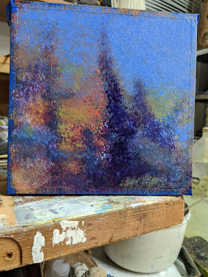
I used water soliable oils and fast dry medium to paint this one. The Palette is quinacridone red, ultra marine bl, hansa yellow, burnt siena. I started with a brush blocking in and got the values right and approx colors,. Then the background trees went in rough and I wiped out neg space between the trees. I used a brush to do lifting out on trees themselves. A painting knife and spatula were used on the bush and flowers. It was a beautiful day, a bit windy but a fantastic Florida spring day.  Stacy Breheim organized this at the Keystone Heights campus of Santa Fe college for the Melrose Outdoor Arts paint out. Michelle Karohalious, Peter Carolin, Frank Barone, were also there along with about 12 others. A good time had by all.

Read Full Post


Evidence of City Life, Rattlesnake Creek, Dry Season

Why paint the creeks?  I, like many of you, have been attracted to watery landscapes for a long time. Early Memories of times at the beach and all the lakes rivers and creeks since then come back when I work on these paintings

The waters edge is still my favorite place. It ticks all my senses. The sounds, the smells, the views, the feel of the land beneath my feet, the taste of the ocean. The creeks and rivers do the same (don't taste the water!). Water in all its locations, is a significant reoccurring subject for me.
Another reason for painting the creeks is to bring attention to the creeks of Gainesville and pretty much everywhere.   The creeks are often where the water shed starts. What happens to our water starts there. Very often these are beautiful places. The light in the woods is unique. Where the water goes tells the story of the land. 

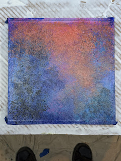
  This painting is done on top of an abstract I did many years ago. I wanted to use this panel to make a new painting but didn't want to destroy the old painting completely.
The full title for this painting is Evidence of City Life, Rattlesnake Creek, Dry Season. I have been walking by this very short arm of the creek for several years and have done small sketches and lots of photos. The area around the creek got drastically changed by the Helen Hurricane. Trees that shaped the shadow pasterns are gone and weeds have replaced them. I'm glad I still have lots of references. It is done with oil sticks over an abstract acrylic painting titled Evidence Of City Life. It was originally an 24x48 cradle panel. Some years ago I cut the top 12 in. off and made a new 12 x 24 sun set painting.. (Y
in Yang Sunset) This painting, 36 x 24, is over the remaining part of the original abstract. Some parts of the first painting can be seen through the oil paint. The sky area with the diagonal line is all part of the original acrylic painting. Some of that painting can also be seen through the grass in the bottom left corner and, in a couple of places, lines made in the acrylic under painting show up under the oil. Over the years, I had several ideas to combine the original abstract with another painting. I'm happy with the decisions I finally came to.


On the right is the original mixed media painting, Evidence of City Life. You can still see some this painting most readily at the top.

Read Full Post


Sand Fence

    This week I have been working on a series of paintings about a snow fence on the sand dunes at St Augustine Beach.   So far I have done a couple of sketches and one 6 x6 that I sold at the downtown show last fall. I have this 6 x 6 and an 8 x 10 finished and 3 more larger sizes with under paintings in ready for the oil paint layer.  I'm really intrigued by this composition because of the way the dunes created a curved line that lead to the snow fence. One end was hidden in the bushes with the other end running out to the dunes. Over time, it got tired of fighting the wind and laid down against the sand. The fence itself made a very interesting shape and that's what caught my eye. 


Layer one. Putting in the dark green trees and a little sand over the acrylic under painting. 

Adding in the beginning of the sand color and marking out where the grasses are going.

 Almost done


The finished 6 x 6 oil. Sand Fence. #2 I decided I didn't like the line of the fence so I painted over the whole middle part and re cut in the fence and added some foreground color.


Read Full Post


The story of Magenta Sky


This week I uploaded a painting that was done during sunset on location at St Augustine Beach. It's very expressive and imagined. Plein Air painting is about inspiration for me, and not always about duplicating the scene precise This is the case for me with sun ups and downs. The sky changes so dramatically and fast at this time of day and the best way for me to express the drama is to react to it. The sky colors, the cloud formations, and the composition  are all changing so fast I sometimes don’t have time to take a picture of what I’m seeing. The colors are Magenta, Teal /turquoise and Nickel Azo yellow (an orange yellow)  . Everything is pretty close to the actual color (on my screen ) except the big middle distance orange/red shape.  The real color is  not orange but darker and more red. It was done during sunset on location at St Augustine Beach but it's very expressive and imagined. Plein Air painting is often about inspiration for me, and not always about duplicating the scene exactly. When working with acrylic I like to work with lots of water and let the paint flow and grow as I watch and push the paint around. It's a technique I used in watercolors a lot.  Painting outside is fun and challenging. Painting from photos is better for capturing and freezing a particular moment of light and shadow. I find that one of the hardest parts of location painting. The shadow shapes change constantly.


Magenta Sky, 9 x 12, acrylic on canvas panel. 


Read Full Post


Spring Stead Project

Springstead creek is one of the places I mentioned in my last art update.

Springstead creek is a small tributary creek that feeds Hogtown creek. There is limited access as it makes it's way through neighborhoods on its way to Hogtown Creek. I was fortunate to get access via a friend's back yard, a short trail and a steep bank. I was pleasantly surprised by the beauty of this urban spot. This section of the creek runs through a steep ravine and light comes through in streaks of filtered, soft shadows and direct light. It's contaminated. That's no surprise to anyone in Gainesville. There was a super fund site just up hill from the head water of this creek that contaminated the creek bottom and although it was years ago, run off from streets, parking lots and fertilizer keeps this and the main creeks contaminated. “Springstead Creek is a tributary of Hogtown Creek. The creek starts just west of Rawlings Elementary School. It flows through the North Main Industrial Park and continues through Pine Haven and Creekside, behind Stephen Foster Elementary, and through Cottage Grove before joining Hogtown Creek in the Forest Creek neighborhood. The creek drains an area that includes a superfund site currently in the process of remediation.” From The Creeks of Gainesville website

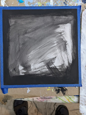
I have access through a private property to a section of the creek that has pretty high cliffs. On the first day I went there I was unprepared to sketch so I could only do some phone photos. I don't usually like to paint directly from photos because the darks and lights are not really what you see. So I like to alter the photo and use that as the reference or I'll make some sketchs from the photos and paint from the sketches. Here is one of the first sketches. I did this from memory in a few minutes while working on a non-painting project. I had a 9 x 12 mixed media sketchbook handy and some black and white fluid acrylic. I used my gloved fingers and a Popsicle stick. There is a short video of close ups of this painting.

9 x 12 acrylic on Canson mixed media paper. When working from memory like this, I can see what sticks in my mind about the composition. Here, I'm remembering the spiral effect of the light and shadow. I also cropped the foreground out. This was not intentional, it's the results of working fast without a plan or reference.

I can see from this painting, that the aspect of the scene that impressed me the the most was the spiral effect of the light and shadow. I exaggerate it in the painting. 

This is one of the altered photos from that day. This is a good example of how photos aren't good to paint from unless you use several different exposures. If the sky is right, It's hard see into the shadows. If you can see into the shadows the sky gets overexposed.

 Here is another tiny painting of the same remembered scene of Springstead done later while testing a medium to use with oil pastels to make them dry. (Still working on that) When doing these quick tests I often conjure up an image of something I'm working on or want to start. It helps me think of the subject in a subconscious way.  There is more to come in this series.

Springstead creek, 4 x 4, oil pastel on multi Media board.

3 X3 oil pastels on multi media board 


Here's an even faster one testing watersoluble ink for sketching in pens, markers and brushpen 4 x 6. Since this post, I went back to the location in August and did 75% of a 9 x 12 acrylic.

Here are some of the stages it went through


This is almost done. The bank has been raised and the tree on the right added. I didn't want too much green so I left the warmer yellow in on the right to give some warm cool contrast


on This when I thought it was done. I wanted more light so I lowered the bank. But after a while I didn't like it. Too straight and off the page. Below is the actual finished painting sold in 2026 at the Spring arts festival I added a tree on the Right and far left, add highlights to the main tree center left and light to the top of the bank, and a small light streak to the right foreground extending one that was there. Add a dark line to the left cliff edge to creat a highlight. I emphasized the “steps” on the back center cliff to better lead the eye.

Read Full Post


Creek Side Sketching

 One of the ways I make sketches while on a walk is using ink to make value and color temperature marks and shapes to make the composition. The black in these sketches is an Elegant Writer marker. When wet, the color separates into green and red. When I got home I experimented with adding the warm yellow ink call Ancient Copper in a fountain pen. It also, is a water soluble ink and activates easily. I'm working on gessoed paper so it's not very absorbent. That helps keep the ink on the surface and not stain the paper which makes it easy to lift off color back to the white paper. When I use Elegant Writer I always use the brush pen to flow out the ink to make lighter values.


Location: Sweetwater Creek between the duck pond and Paynes prairie, Water soluble Ink marker and pen. 4.5 x 6 on gessoed paper


SThe second painting below is the same area further down stream.


Read Full Post


Bad Beach Day

Bad Beach day started out as an experiment with water soluble oil paint and acrylic medium. All the color in this painting is oil color but all the texture is from acrylic medium.  I was able to mix a small amount of pigment into the medium and the medium gave the pigment body. I could have gotten a similar look with cold wax medium, however the painting would have taken quite a while to dry and I would have had to work in layers probably. Cold wax medium does not get hard. It always remains the hardness of a beeswax candle or slightly harder depending on the ratio of wax to oil paint. The acrylic gel medium is very hard and requires no protective framing or glass. It won't melt if you leave it in the car on a hot day. (Who would do that with any painting?) I wasn't expecting this to be a real painting. But I really like the way the sky came out using that medium with the oil paint. I'm not sure I could have gotten that exact look with acrylic only. Working on it brought back memories of a very stormy day at St Augustine Beach. We thought it was going to be a bad day to go to the beach and almost turned around but it turned out to be a very interesting day with wind and rain, foamy surf, beautiful broken clouds, patches of blue sky, and no people.

Read Full Post


Transparent Interactions

   Transparent Interactions, 24 x 16. Wood , plastic, push pins. Opening Friday, May 26 2023, Gainesville Fine Art Association gallery, 1314 S Main St,  Gainesville The show is called Transparency, I'm being transparent about my process.    I painted 2, 12 x 12 cradled panels white and joined them with 4 inches of overlap using  corner brackets. I wanted the the color to interact with the wall as well as with each other and the white panels and I didn't want just a rectangle. This overlap gave me a finished piece of 24 x 16 which is a 3 x 2 ratio and 2 gaps 4 x 12 inchs that allow the color to cast on the wall.     This piece came about due to a monthly theme at the GFAA gallery. The June '23 theme is Transparentsy. We could translate that however we wanted.   I decided to enter this show because I instantly had ideas on how to  show how transparent colors interact to make more colors.  My first impulse was to use layers of pigment. However, it would require lots of drying time and layers and experiments that I didn't have time for. I only had a week .    I remembered I had seen clear plastic filter sheets .   The set I bought had the full spectrum. Since I had little time to devote to this project, I decided to impose limits.   Rather than cut the sheets into interesting shapes and build a design, I opted to leave them as they came. I only altered one sheet, I had to trim the edge off one that got ruined while exploring adhesives   That was the next challenge. How to attach the filters. Everything I tried changed the color and the way the light went through the filter.  I couldn't use tape or glue because of that plus mistakes ruined the filters.  I only had one set of colors and one shot at doing it. Another limitation was I wanted to be able to re use the materials if the piece didn't sell during the 1 month  show. I wanted it to be impermanent.   Everything I tried was wet and permanent. I had some copper tacks used in stretching canvas, and when I mentioned that to Michelle, she said she had some clear push pins. Perfect.

Read Full Post


The January Small Works Release

This is just a quick post to show some of the small paintings in the show at the Artisans Guild Gallery in Gainesville FL. All these paintings were created or finished during the month of January.

  The purpose of the small works show was to present paintings priced well for February gift giving.  Small paintings are great for intimate spaces and places where close observation is automatic. One of the best spots is the bathroom. Now, there are some artists who wouldn't admit their work should be in the bathroom but I find it's a great place for several small paintings. Any bit of wall space will work and you get lots of opportunities to look at them closely. If you are in there by yourself, you can take a few quiet minutes to get up close to your art and see where the day dream takes you or invent a story or recall a memory.  Where would you hang or display a small painting? 

   There were 15 new works installed January 27, some may have sold by the time you see this post.  Images of the paintings can be seen on my Facebook page and my Instagram.  Join me via email to get a preview announcement of the next release of paintings to this website and a 10% discount on your favorite before I promote this work to the public.

Read Full Post


New Series of Abstracts


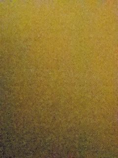
 The idea for this series came about when I decided to enter the Gainesville Fine Arts Association virtual art exhibition "Close-ups". I have done paintings that could be considered close ups but I wanted to make something new.  The idea of translating a super close-up cell phone picture into paint came to me when I laid my camera on the kitchen cutting board. The screen showed a graded color field of tiny yellow and green dots.  I manipulated and cropped the grainy, out of focus pictures for contrast, saturation and lighting effects to get what I thought was an interesting composition of shapes, texture, and color.
 This was done by spattering with a toothbrush, stabbing and dabbing with a brush, and blotting with paper on an 8 inch panel. I was trying to get a blend of colors that optically mix to give a sense of gradation, light and layers. Probably more akin to impressionist goals. Lots of small marks of different colors in a close value range to create color fields to represent light. My reference was not the landscape but an out of focus, extreme close up of an oak cutting board.


Cutting Board: Close Up 8x8 acrylic on cradled panel


 Rather then printing out the photo, I decided to try to translate it into paint.

original photo of the paper napkin
after cropping and editing


starting to lay in the big shapes
adding lighter colors and going back and forth with lights and darks


Paper Napkin: Close Up 8 x 8 on cradled panel


 The challenge was, and still is, to find a way to turn this almost airbrush/ spray paint effect of the soft blending of multiple colors into a painting on the panel without using spray paint.
 I have done several paintings with spray cans and could probably get the effect I'm after doing it that way (I still might try that) but I like the more direct approach of applying paint with tools by hand.

The original photo of the blue tape after some editing. 


Blue Tape: Close Up 8 x 8 Acrylic on cradled panel


  There is something mesmerizing about the repeated dabbing, stabbing, bouncing, drumming technique of applying the paint. I've used that technique many times before probably in almost every painting. But in this series that's the predominant technique.

  The tools I used in these three paintings were toothbrush, scrub brush, chip brush, paper towels and paper napkins.
  I started by laying down large shapes of color but as the paintings progressed interesting shapes and patterns arrived and evolved. As usual, the painting took on a life of its own and the reference became less important.

 I like the outcome of the process and the challenge of trying to recreate the veiled effect in the altered photos. However, getting there is not as much fun as working with the pallet knife. In that case I like the outcome and I like the process of pushing the paint around with the knife.
 In this case I'm still working on the technique to find a process that I enjoy. Spattering with the bristle brushes can get a much finer dot pattern and create a more veiled effect than dabbing with the brush but it's a tedious, time consuming process. Dabbing and rolling with a paper towel or napkin to get almost a roller effect is more fun than spattering. However, spattering with the bristle brushes can get a much finer dot pattern and create a more veiled effect but it's a tedious time consuming process.
  I think I will continue this series. With more practice, I will be able to get a blended effect of color similar to an impressionist technique where the individual spots of colors mix in the eye of the beholder .That's the idea anyway.  See more paintings at Jewelry Art Studio


Read Full Post